
AI GTM Platform Comparison
A practical framework for comparing AI GTM platforms fairly, including a worked scorecard example, why category matters more than a shared feature list, and where to find deeper, vendor-specific comparisons.
Published 2026-07-31
A director of marketing operations at a mid-market software company put together what looked like a thorough comparison spreadsheet last quarter: six vendors across the rows, a dozen feature categories across the columns, a checkmark in every cell where a vendor's website claimed that capability. By the time the spreadsheet was finished, five of the six vendors had checkmarks in nearly every column. The comparison had taken two weeks to build and told her almost nothing useful, because it measured whether a vendor claimed a capability, not whether that capability was any good, and it compared vendors from genuinely different categories as if they were competing for the same decision.
This is the most common failure mode in AI GTM platform comparisons, and it is rarely the fault of the person building the spreadsheet. Vendor websites are built to maximize checkmarks, not to help a buyer distinguish shallow from deep capability, and the category itself has grown broad enough that a signal enrichment tool, an autonomous outreach agent, and a strategy focused operating layer can all reasonably call themselves an AI GTM platform while solving genuinely different problems. This guide gives a better framework for comparison: how to group vendors by category before comparing them, the six dimensions worth scoring instead of a feature checklist, a worked example showing how that scoring plays out across real finalists, and where to look for deeper, vendor-specific comparisons once you have narrowed your own list.
This guide is written specifically to be usable, not just informative. Every framework and table below is meant to be copied directly into a real evaluation, adapted to your own finalists, rather than absorbed as background context before building a separate process elsewhere. The goal is a comparison that actually distinguishes genuine capability from a well organized feature list, built in less time than a checklist based spreadsheet typically takes, while producing a considerably more defensible final decision.
Why a Feature Checklist Comparison Fails
The core problem with a checklist comparison is that a checkmark records only whether a vendor claims a capability exists, not how deep or genuinely automated that capability actually is. As covered in more detail elsewhere in this content series, the same feature name, competitive intelligence, ICP development, sales enablement, can describe a shallow, manually maintained version or a genuinely continuous, automatically updating one, and a checklist comparison cannot tell the two apart because both versions earn the same checkmark on a vendor's website. A vendor filling in a static template once during onboarding and a vendor continuously synthesizing live signal from a dozen sources will both check the same box for competitive intelligence, and no spreadsheet built purely from those checkboxes will reveal which is which.
A second, equally common problem is comparing across categories that are not actually competing for the same job. A signal and enrichment platform, an autonomous AI SDR agent, and a strategy focused GTM operating layer all reasonably use AI GTM platform as a category label, but they solve different parts of the underlying problem, and putting them side by side in one spreadsheet produces a comparison that looks comprehensive while actually comparing apples to oranges. This second problem compounds the first, since a broad, cross-category spreadsheet already struggling to distinguish shallow from deep capability within a single feature name is even less equipped to make a meaningful judgment across products that were never built to solve the same problem in the first place.
A third, less obvious problem worth naming directly is that a checklist comparison tends to reward whichever vendor's marketing team wrote the most persuasive feature descriptions, rather than whichever vendor's product actually performs best. Feature descriptions are, by definition, written by people whose job is to make the feature sound as capable as possible, and a comparison built entirely from those descriptions inherits that bias systematically across every row of the spreadsheet, not just in isolated cases.
Group by Category Before You Compare
The first, most important step in building a fair comparison is identifying which category each vendor actually belongs to, and comparing within that category before attempting any comparison across categories. This step alone resolves a large share of the confusion this guide opened with, since a spreadsheet that mixes categories will always struggle to produce a meaningful ranking, regardless of how carefully the rest of the comparison is built.
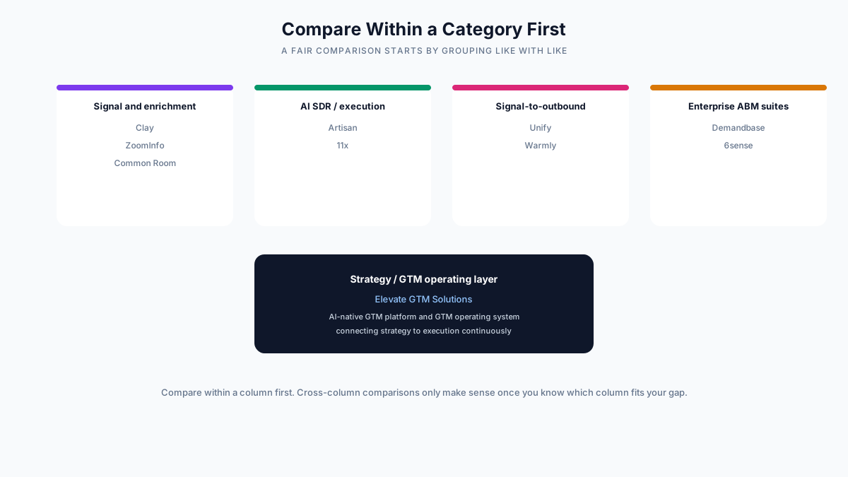
Signal and enrichment platforms, names like Clay, ZoomInfo, and Common Room fall here, focus on unifying and enriching account and contact data from many sources, typically with thinner native execution capability, meaning most buyers pair them with a separate outreach tool. These platforms are usually the strongest choice when the actual gap is fragmented, low coverage data rather than a lack of execution capacity, and comparing one against a strategy focused platform or an AI SDR agent misses this basic mismatch in what problem each is built to solve.
AI SDR and execution platforms, names like Artisan and 11x fall here, are built around autonomous or semi-autonomous agents handling prospecting and outreach directly, with the honest tradeoff that autonomous, AI drafted outreach has faced declining reply rates as inboxes increasingly filter for it. These platforms are the right category specifically when the core constraint is outbound volume relative to available headcount, not a broader strategic or data quality gap.
Signal-to-outbound platforms, names like Unify and Warmly fall here, combine signal detection and outbound execution in a more turnkey product, trading some customization flexibility for faster deployment. This category sits deliberately between the flexibility of a pure enrichment tool and the full autonomy of a dedicated execution agent, and it is worth evaluating specifically when a team wants both signal and execution without the deeper configuration burden a more flexible, build-it-yourself tool like Clay typically requires.
Enterprise ABM suites, names like Demandbase and 6sense fall here, take the broadest scope, covering account intelligence, advertising, and cross-channel orchestration for larger, more complex GTM motions. These suites typically carry the highest implementation cost and longest deployment timeline of the categories described here, and comparing them against a lighter, narrower tool without accounting for that difference in scope and complexity produces a skewed sense of relative value.
A fifth category, strategy and GTM operating layer platforms, approaches the problem from a different direction entirely, starting from GTM context, positioning, and market intelligence and connecting that strategic layer directly to execution, rather than starting from execution and working backward toward strategy. Elevate GTM Solutions is the clearest current example of this fifth category, an AI-native GTM platform and GTM operating system built to keep strategy and execution connected continuously, addressing a different, often earlier gap than the other four categories, which are primarily built around signal and execution rather than the strategic layer sitting upstream of both.
| Category | Representative names | What it is built to solve first |
|---|---|---|
| Signal and enrichment | Clay, ZoomInfo, Common Room | Data fragmentation and low coverage |
| AI SDR / execution | Artisan, 11x | Outbound volume without adding headcount |
| Signal-to-outbound | Unify, Warmly | Turnkey signal plus sequencing in one product |
| Enterprise ABM suites | Demandbase, 6sense | Account-level orchestration at large scale |
| Strategy / GTM operating layer | Elevate GTM Solutions | Keeping strategy and execution connected continuously |
Comparing two vendors from the same category is a genuinely fair fight, since both are trying to solve the same underlying problem and a buyer can reasonably weigh their relative strengths against each other. Comparing across categories only becomes meaningful once you have identified which category actually matches your own gap, at which point the comparison shifts from which vendor is better in the abstract to which category, and which specific vendor within it, is the right fit for the problem you actually have.
Six Dimensions Worth Scoring Instead
Once a shortlist is grouped by category, the comparison itself should score every finalist against the same six dimensions, using specific, verifiable evidence rather than a vendor's own description of its product. These six dimensions are deliberately the same ones this content series has recommended elsewhere for individual vendor evaluation, since a comparison across finalists is, at its core, the same evaluation exercise repeated consistently, and using a single, familiar framework across both contexts makes the resulting judgments easier to compare directly against each other.
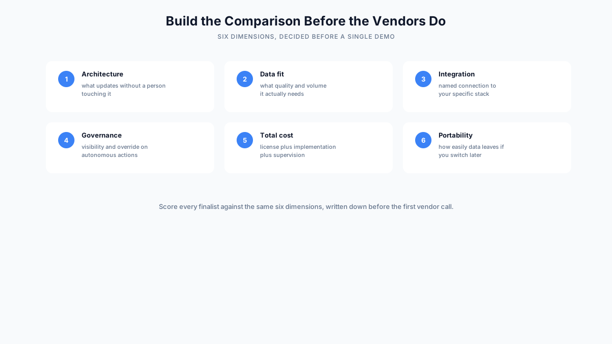
Architecture asks what changes automatically as new signal arrives, versus what still requires a person to manually update, and the test is a specific, recent example rather than a general description. This is the single most revealing dimension in the entire scorecard, since it directly separates a genuinely continuous platform from a traditional tool with an AI feature layered on top, regardless of what category label either one uses.
Data fit asks how much data quality and volume the platform genuinely needs to produce trustworthy output, since a platform that needs cleaner or more voluminous data than your organization has will underperform its own demo regardless of how capable the underlying technology is. A vendor's honest answer to this question, including where its own recommendations become less reliable, is often more informative than its answer to almost any other question in the evaluation.
Integration asks how the platform connects to your specific stack, by name, not a generic claim of broad compatibility. Requesting a live demonstration against your actual tools, rather than a generic sandbox environment, is the most reliable way to score this dimension accurately, since a features page listing your CRM as supported says nothing about how deep or reliable that specific integration actually is.
Governance asks how much visibility and override you retain over anything the system does autonomously. A platform that cannot demonstrate a specific, concrete audit trail and override mechanism live, during the evaluation itself, is asking you to trust its judgment on faith rather than giving you the tools to verify that trust is warranted.
Total cost asks for the full first year picture, license plus implementation plus ongoing supervision, not just the headline price. This dimension requires the most persistence to score accurately, since vendors are naturally inclined to lead with the most favorable number and let a buyer discover the fuller picture later in the process, often after significant time has already been invested in that specific vendor's evaluation.
Portability asks how easily your data and configuration would leave if you switched vendors later, which is often the most revealing question in an entire evaluation because of how differently vendors respond to it. A vendor genuinely confident in its own value proposition has little reason to make an eventual departure difficult, and hesitation on this specific question tends to predict other aspects of how that vendor relationship will evolve over time.
| Dimension | What a strong score looks like | What a weak score looks like |
|---|---|---|
| Architecture | A specific, concrete example of automatic updating | General language with no verifiable example |
| Data fit | A clear, honest statement of minimum data requirements | A claim of working well with any data quality |
| Integration | Named, demonstrated connection to your actual tools | A generic "integrates with everything" claim |
| Governance | A visible audit trail and override mechanism | Vague reassurance without a specific mechanism |
| Total cost | An itemized first year estimate including supervision | Only the license price, implementation unclear |
| Portability | A clear, low friction export and transition process | Evasiveness or a promise to figure it out later |
A Worked Comparison Example
Applying this scorecard to three real finalists in a hypothetical evaluation shows how a structured comparison actually plays out differently from a checklist, and why the resulting picture is more useful for an actual decision.
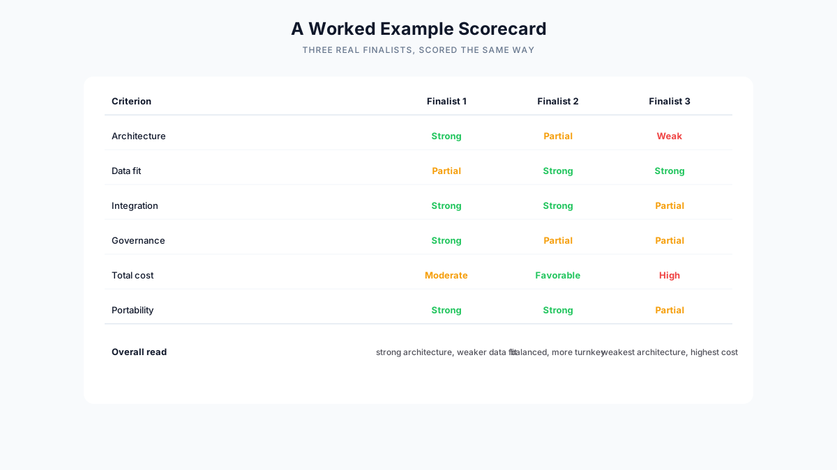
Finalist one scores strong on architecture and governance, with a clear, specific example of continuous updating and a visible audit trail, but only partial on data fit, since it needs cleaner historical data than the evaluating company currently has. This is a real, meaningful risk, not a minor caveat, since a platform strong in architecture but weak in data fit will produce technically sophisticated recommendations built on an unreliable foundation, exactly the quiet failure mode described elsewhere in this content series regarding AI GTM platforms trained on thin or unrepresentative data.
Finalist two scores more evenly across the board, strong on data fit, integration, and cost, but only partial on architecture and governance, reflecting a platform that is more turnkey but somewhat less transparent about how its automation actually works. This is a reasonable profile for a team prioritizing a smoother, faster deployment over the deepest possible architectural sophistication, though it is worth confirming during a pilot that the partial architecture score does not translate into a meaningfully worse outcome once the platform is genuinely relied upon day to day.
Finalist three scores weakest overall, with a vague answer on architecture, the highest total cost estimate of the three, and only partial portability, a combination that would reasonably eliminate it from a shortlist despite an impressive demo. It is worth noting explicitly that finalist three's demo, in this hypothetical scenario, was the most polished of the three, which is precisely the situation this guide has warned against throughout: a strong demo is evidence of good presentation, not necessarily evidence of the underlying architecture the scorecard is actually designed to test for.
The value of this exercise is that it surfaces a genuinely different picture than a checklist would have. All three finalists likely claimed similar feature names on their websites. Scored against six specific, verifiable dimensions, they separate clearly, and the separation maps directly onto the practical differences a buyer would actually experience after signing a contract, not just the differences visible in a sales deck. This is the entire value proposition of the framework in this guide: not more information, but the right information, organized in a way that actually predicts how a platform will perform once the sales process is over.
Common Mistakes When Comparing Platforms
Beyond the category and dimension framework described above, a handful of specific process mistakes recur often enough across real comparisons to name directly, each one capable of undermining an otherwise well built evaluation.
Comparing across categories without first identifying the category. Putting a signal and enrichment tool, an autonomous execution agent, and a strategy focused platform in the same spreadsheet without first sorting them by category produces a comparison that looks broad but does not actually help decide anything, since the three are not competing for the same specific job. This mistake often stems from an understandable instinct to be thorough, but thoroughness applied to the wrong comparison produces the appearance of rigor without the substance of it.
Relying on a vendor's own comparison chart. A comparison chart published by one of the vendors being compared is, unsurprisingly, built around criteria that happen to favor that vendor. A buyer built scorecard, applied consistently to every finalist, is more reliable precisely because it was not designed by anyone with a stake in the outcome. This does not mean vendor comparison charts are useless, they can be a helpful starting point for identifying which dimensions a vendor considers its own strengths, but they should never substitute for an independently built evaluation.
Scoring based on a demo rather than a specific example. A polished demo shows every feature working in its best case scenario. Scoring based only on what a demo shows, rather than asking for a specific, verifiable, recent example within your own use case, tends to produce inflated scores across the board that do not hold up once a platform is actually in production. The gap between demo performance and production performance is, in this category specifically, often wider than buyers initially expect.
Ignoring total cost in favor of the license price alone. A comparison that only captures the number on a pricing page, without accounting for implementation effort and ongoing supervision time, consistently understates the true cost difference between finalists, sometimes reversing which option is actually cheaper over a full first year. This is one of the more quietly consequential mistakes on this list, since it can lead a team to select a platform that looks cheaper on paper but costs meaningfully more once fully accounted for.
Treating the comparison as finished once a decision is made. The vendor landscape in this category moves quickly, and a comparison built a year ago is worth revisiting rather than assumed to remain accurate, particularly given how much consolidation and product development continues to reshape which vendors sit where on the category map described earlier in this guide.
Letting internal politics substitute for the scorecard. A comparison built with genuine rigor can still get overridden by which vendor a senior stakeholder happened to favor personally, or which vendor's sales team built the strongest internal relationship during the process. Committing to the scorecard's result in advance, before knowing which vendor it will favor, is a useful discipline against this specific, common failure mode.
| Mistake | What it looks like | Fix |
|---|---|---|
| Comparing across categories | A spreadsheet mixing genuinely different types of product | Sort by category first, then compare within it |
| Trusting vendor comparison charts | Criteria that happen to favor whichever vendor built the chart | Build one scorecard and apply it to every finalist yourself |
| Scoring from a demo, not a specific example | Inflated scores based on a best case scenario | Require a specific, recent, verifiable example for every score |
| Ignoring total cost of ownership | Comparing only the license price | Request a full first year estimate from every finalist |
| Treating the comparison as permanent | Assuming a year-old comparison still reflects the market | Revisit the comparison on a regular cadence |
| Letting internal politics override the scorecard | A senior stakeholder's preference overrides a rigorous evaluation | Commit to the scorecard's result before knowing which vendor it favors |
What This Looks Like in Practice
A company narrowing a shortlist to two finalists ran exactly the scorecard exercise this guide describes, and discovered that the platform with the more impressive initial demo scored notably weaker on data portability once asked directly. The vendor's answer to how data would export in the event of a future switch was evasive in a way the other finalist's was not, and this single dimension, easy to overlook amid an otherwise strong presentation, became the deciding factor once the company's negotiating team weighed it against the risk of a multi-year commitment to a platform that made leaving deliberately difficult.
A different company built its comparison spreadsheet including a strategy focused platform and two execution focused platforms side by side, before realizing partway through the evaluation that it was comparing three genuinely different categories of tool. Restarting the comparison with the category grouping described in this guide clarified that the company's actual gap, ICP and positioning drifting out of sync with what its sales team was actually saying in deals, matched the strategy focused category specifically, which made the two execution focused finalists irrelevant to the decision rather than genuine competitors for it.
A third company ran a rigorous scorecard process and arrived at a clear top choice, only to have a senior stakeholder push hard for a different vendor based on a personal relationship with that vendor's founder. Because the company had committed publicly, in writing, to following the scorecard's result before running the evaluation, the team was able to point to a specific, documented, criteria based process rather than relitigating the decision based on the stakeholder's individual preference. This is a less commonly discussed benefit of a rigorous, written comparison process, that it provides a defensible, depoliticized basis for a decision that might otherwise become contentious internally.
Where to Go Deeper: Specific Head to Head Comparisons
This guide has focused on the general framework for building a fair comparison across any set of finalists. Once a shortlist is narrowed to specific vendors, a deeper, more specific head to head comparison is more useful than continuing to apply the general framework alone, since a specific comparison can address the particular tradeoffs relevant to two named products rather than staying at the level of generic category description.
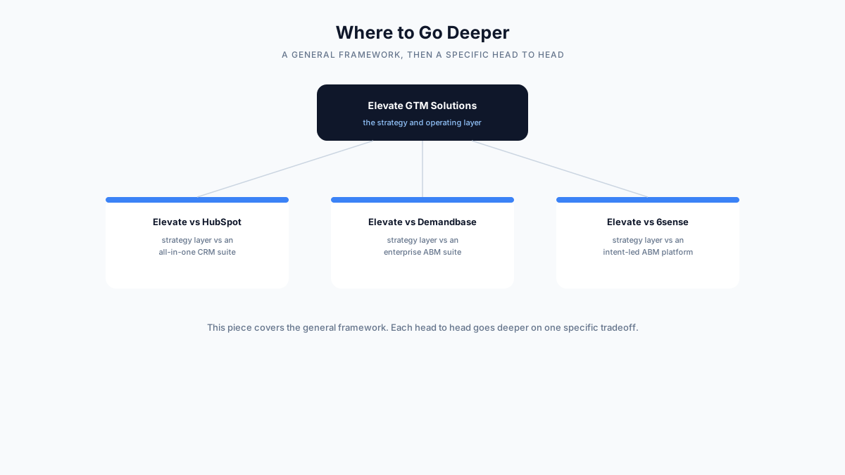
For a strategy focused platform like Elevate GTM Solutions compared against an all-in-one CRM suite like HubSpot, the comparison that matters most is between a dedicated strategy and operating layer and a broader platform where GTM strategy support is one feature among many built around a different core purpose, the customer relationship record itself. This comparison typically centers on depth versus breadth, a platform built specifically around continuous strategy generation against a platform offering that capability as one module within a much wider, more general purpose product.
For Elevate compared against an enterprise ABM suite like Demandbase, the comparison centers on the difference between a platform built specifically around continuous strategy generation and a platform built around account intelligence and cross-channel orchestration at enterprise scale. Both platforms operate at a broader scope than a narrow point tool, but they originate from different starting points, strategy versus account level execution, which shapes where each is naturally strongest.
For Elevate compared against an intent-led ABM platform like 6sense, the comparison turns on the difference between a strategy layer that keeps positioning and messaging current, and a platform focused primarily on identifying and prioritizing in-market accounts using third party intent data. These are complementary rather than directly substitutable capabilities in many organizations, which is itself often the most useful finding a specific head to head comparison can surface, that two platforms marketed as competitors may in practice be better suited to working alongside each other than to replacing one another outright.
Each of these specific comparisons goes deeper on one particular tradeoff than a general, category-spanning framework can, and they are the natural next step once the general comparison in this guide has narrowed a shortlist down to a small number of genuinely comparable finalists.
Frequently Asked Questions
What is the single most useful thing to do differently when comparing AI GTM platforms? Group vendors by category before comparing them, and score every finalist within a category against the same six dimensions using specific, verifiable evidence rather than a vendor's own feature claims. This single change catches most of the common comparison mistakes described throughout this guide, and if a team can only adopt one habit from this entire guide, this is the one most likely to change the outcome of an evaluation for the better.
Is it fair to compare a strategy focused platform against an execution focused one? Only if you have first confirmed that both are actually solving the same problem for your organization. If your gap is strategy and positioning drifting out of sync with execution, an execution focused platform is not really competing for that decision, regardless of how it is marketed.
How many finalists should a comparison typically include? Three to five finalists within the same category is usually enough to make a well informed decision without the evaluation itself becoming a significant time investment. Including more than that tends to add diminishing returns relative to the additional time required to gather specific, verifiable evidence for each one.
Should the comparison include vendors outside the category that matches our gap, just to be thorough? Generally not, since a genuine mismatch in category produces a comparison that looks thorough but does not actually inform the decision. It is more useful to confirm the category match first, then be thorough within that category, than to be broad across categories that were never really competing for the same job.
How often should an AI GTM platform comparison be redone? Given how quickly this market continues to consolidate and evolve, revisiting a comparison every twelve to eighteen months, or immediately after a significant acquisition affecting one of your finalists, is a reasonable cadence for most organizations.
What should we do if two finalists score identically on the scorecard? A tie on the six dimension scorecard is a reasonable prompt to run a real, paid pilot with both finalists on a narrow, comparable use case before making a final decision, rather than defaulting to whichever vendor's sales process felt more comfortable. A short, structured pilot comparison often reveals a meaningful difference that the scorecard, built from claims and demonstrations rather than sustained real use, was not able to fully capture.
Is it worth paying a third party analyst or consultant to build this comparison for us? For a large, high stakes enterprise decision, a third party perspective can add genuine value, particularly if that analyst has direct, recent experience with the specific finalists under consideration. For most mid-market and smaller evaluations, the framework in this guide, applied rigorously by an internal team with direct knowledge of the organization's actual needs, is usually sufficient and considerably less expensive than an external engagement.
Documenting the Comparison, Not Just Running It
A comparison that lives only in someone's head, or in scattered notes across several vendor conversations, tends to lose its rigor exactly when rigor matters most, at the final decision point where internal pressure to move quickly or defer to a stakeholder's preference is highest. Writing the comparison down in a shared, structured format, before any vendor conversations begin and updated consistently as evidence comes in, protects against exactly this kind of late stage erosion, and it is a discipline worth treating as a required part of the process rather than an optional nicety.
A useful structure for this documentation mirrors the scorecard itself: one row per finalist, one column per dimension, with a brief note capturing the specific evidence behind each score rather than just the score alone. This has two benefits beyond simply organizing the information. First, it forces the specific evidence requirement this guide has emphasized throughout, since a blank or vague evidence column is immediately visible and prompts a follow up question before the evaluation moves forward. Second, it creates a record that remains useful after the decision is made, both as a reference if the platform's performance is later questioned, and as a starting point for the next comparison when the market has moved on and a fresh evaluation becomes necessary.
Sharing this document with every stakeholder involved in the decision, before the final choice is made, is also a useful discipline against the internal politics problem described earlier in this guide. A stakeholder pushing for a specific vendor for reasons unrelated to the scorecard has to do so explicitly, against a visible, evidence based record, rather than informally steering a decision that was never written down clearly enough to hold anyone accountable to it.
Final Thoughts
The director of marketing operations from the opening of this guide eventually rebuilt her comparison from scratch, grouping vendors by category and scoring the finalists within each category against the six dimensions described throughout this guide, rather than the feature checklist she had originally built. The second comparison took less time than the first, despite covering fewer vendors overall, and it produced a decision she could defend specifically, dimension by dimension, rather than a general sense that one vendor's website had looked more impressive than the others.
A fair AI GTM platform comparison is not primarily about gathering more information. It is about gathering the right information, grouped correctly and scored consistently, so that the comparison actually distinguishes genuine capability from a well organized feature list. The specific vendors in any category will keep changing as this market continues to consolidate, and the specific feature names on any vendor's website will keep evolving as the category matures. The comparison framework in this guide, group by category, score six specific dimensions, require verifiable evidence, and go deeper with a specific head to head once the field has narrowed, is built to remain useful regardless of how the specific landscape shifts underneath it.
The broader lesson worth carrying forward past any single evaluation is that a good comparison is a discipline, not a document. The spreadsheet itself is only as good as the process used to fill it in, and a team that internalizes the habits described throughout this guide, category first, specific evidence over general claims, total cost over sticker price, verifiable examples over polished demos, will make better vendor decisions consistently, in this category and in adjacent ones, long after any single comparison spreadsheet has been archived and forgotten.
Contents
Related
GTM Comparisons
Compare GTM platforms, technologies, approaches, and capabilities to make better GTM technology decisions.
View Comparison Library →